Multiple people have asked me for a tutorial of how I do colour in Photoshop. A lot of people think my prints are analogue screen prints, but they’re actually mostly digital and printed on a Canon giclée printer. I draw the ink lines by hand, but all the colour and texture is created in Photoshop.
This is an image I created for a calendar I’m making- to be finished this weekend. Pre-orders can be found here.
It takes me between 4-8 hours start to finish to create an image. The Photoshop process I showed in this tutorial took me just under two hours. It’s not so much the physical process of adding the colour that takes time, but choosing which colours and textures to add where, and trying things out and deleting them until they look right.
I have assumed that you have basic knowledge of how to operate Photoshop and Illustrator here- if you don’t it’s probably not going to be very interesting. I am using the most recent versions on a Mac. I’m afraid I can’t teach people how to draw or get the patience to sit in front of the computer for hours on end adjusting layer transparency percentages.
I also used a Wacom graphics tablet. It certainly is possible to do the same thing with a mouse, but it’s much, much easier with the pen and tablet.
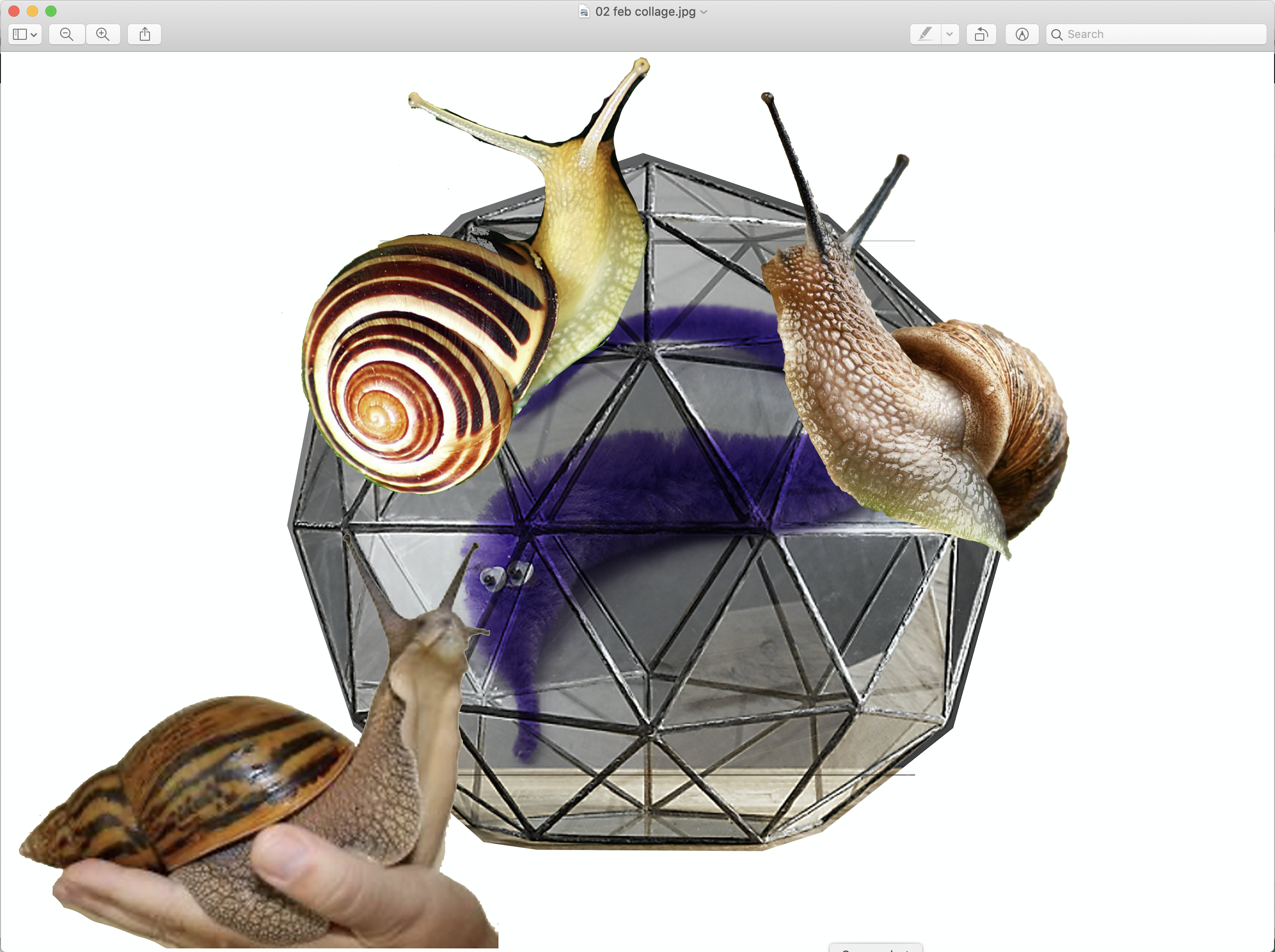
First of all I made a collage from reference photos. I printed it out and used a lightbox to trace the angles of the geodesic glass dome (originally a plant terrarium). (Dirty industry secret- a lot of illustrators trace stuff using a lightbox, especially things like tricky perspective angles. Even Quentin Blake uses one!) I usually draw with non-photo blue pencils- they’re easier to distinguish against the ink, and barely show up in black and white scans. I use Posca markers for the inking. The basic drawing took about an hour.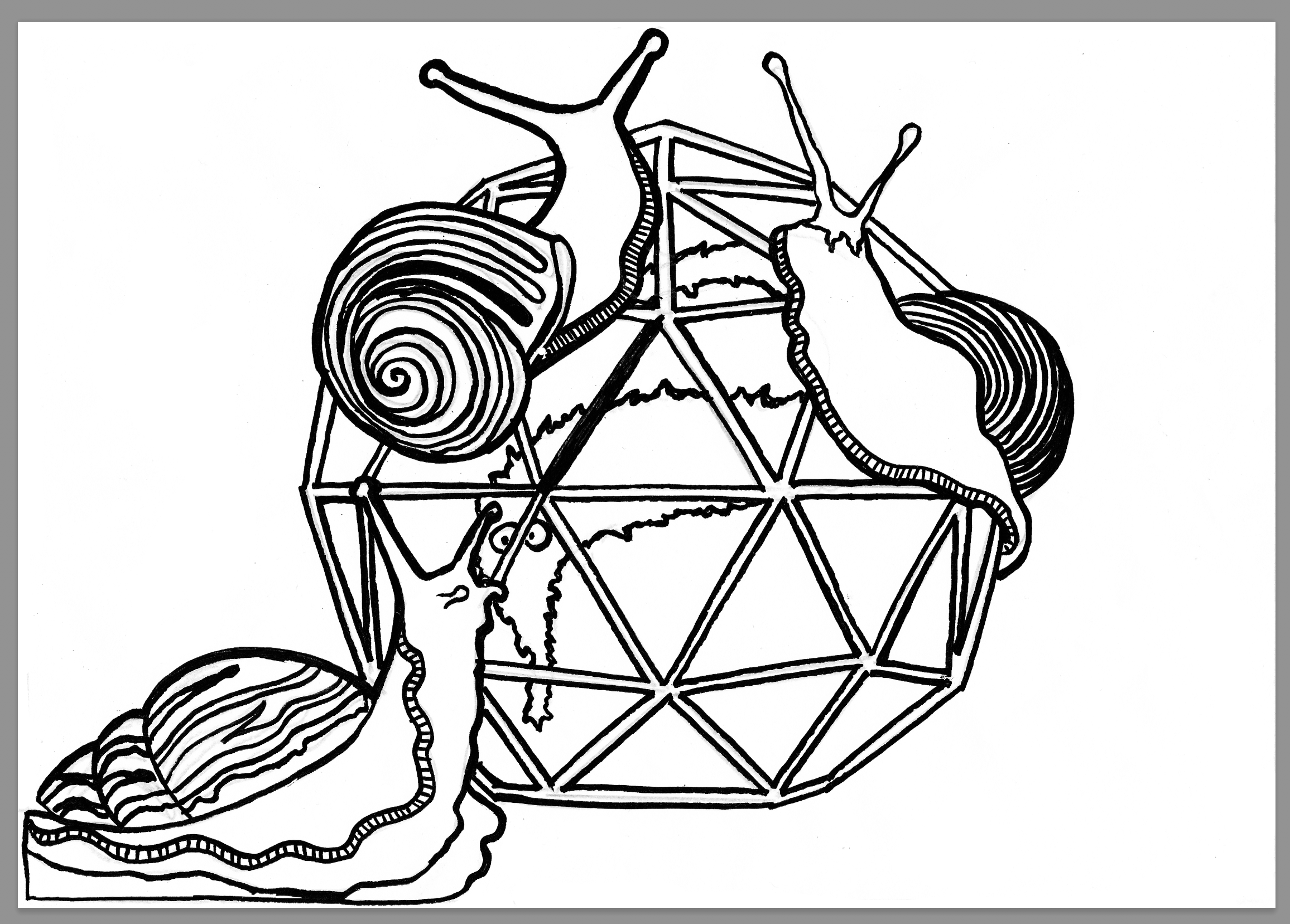
I scan the ink drawing in monochrome, and import to Photoshop. Upping the contrast and brightness makes a lot of the pencil lines disappear, and the eraser tool takes care of the rest.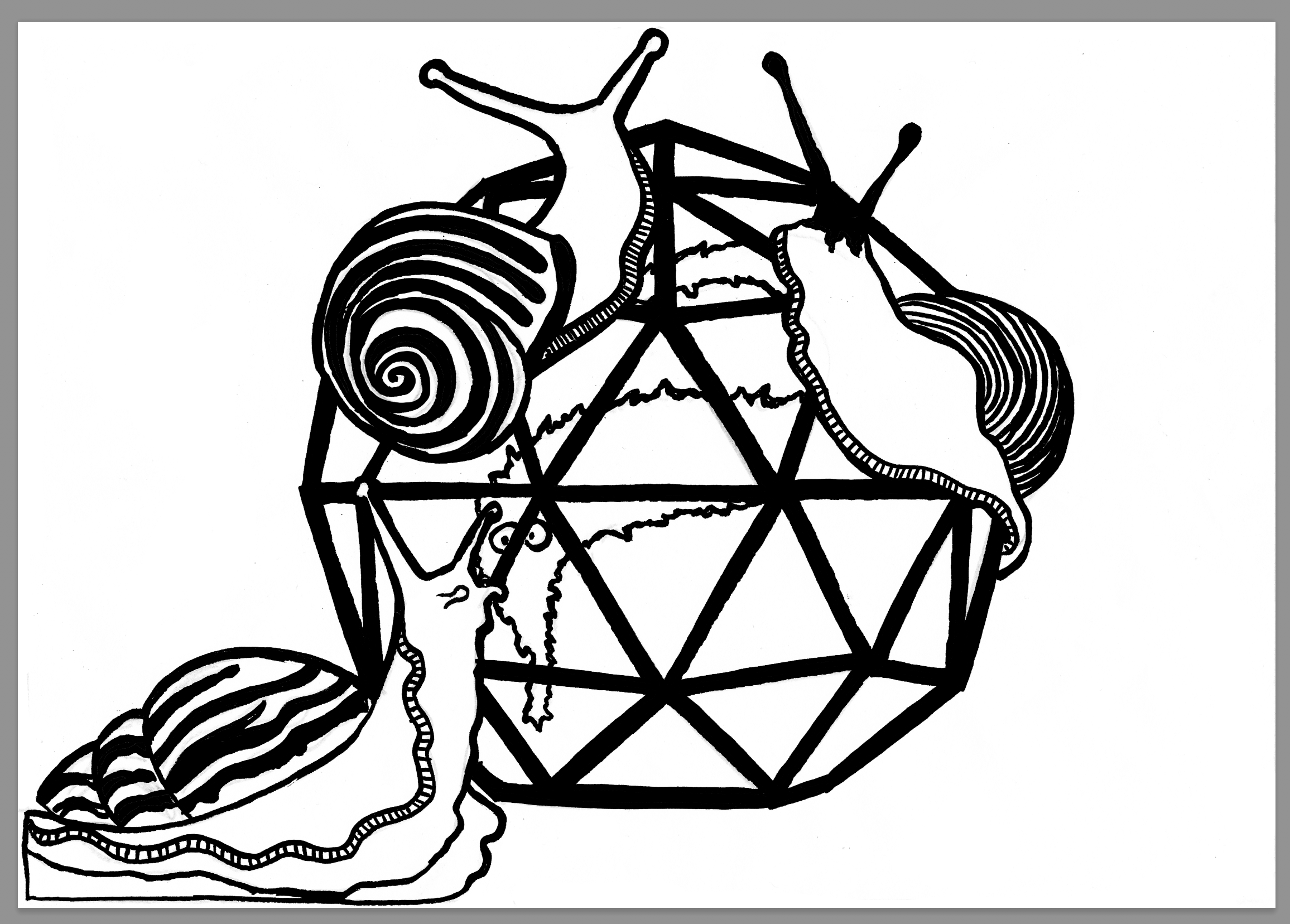
I used the fill, basic brush and eraser tools to fill in any solid areas and correct mistakes.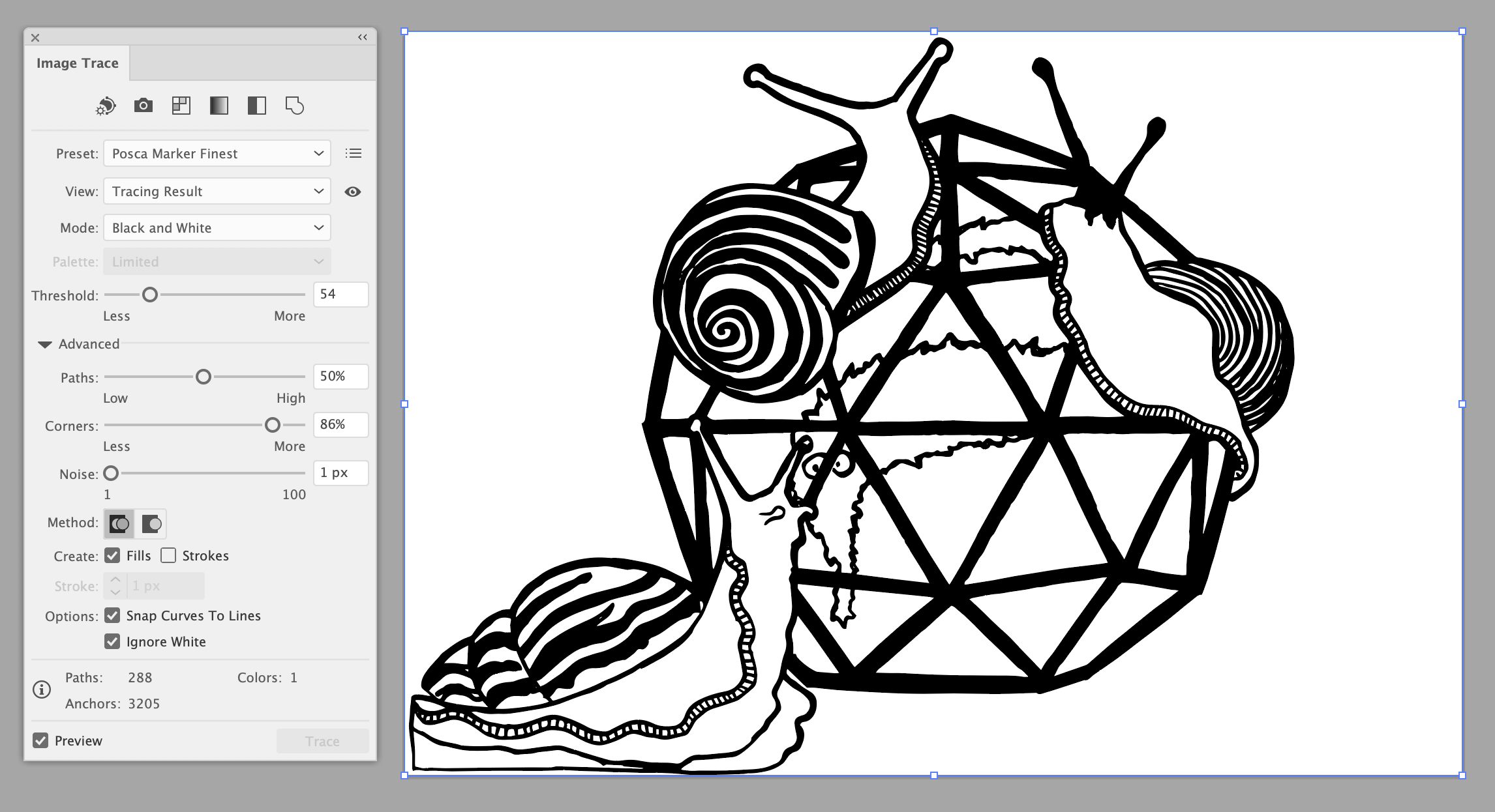
I then close the file in Photoshop and import to Illustrator. I used the auto-trace mode with these custom settings (I have a few profiles set up that work well with my ink drawings), expand the paths, and then make into a Live Paint object and expand again. For some reason I find turning it into a Live Paint image makes the colour change work better.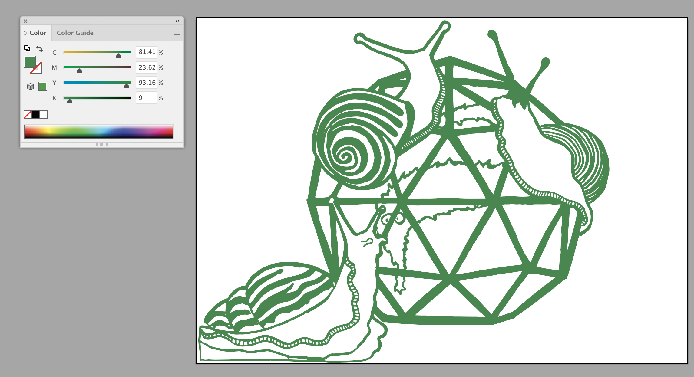
Then change the paths from greyscale to CMYK mode, and choose a new colour. I had created a basic colour pallette which I test printed on the paper for the final product, and had a list of colour hex codes for them all.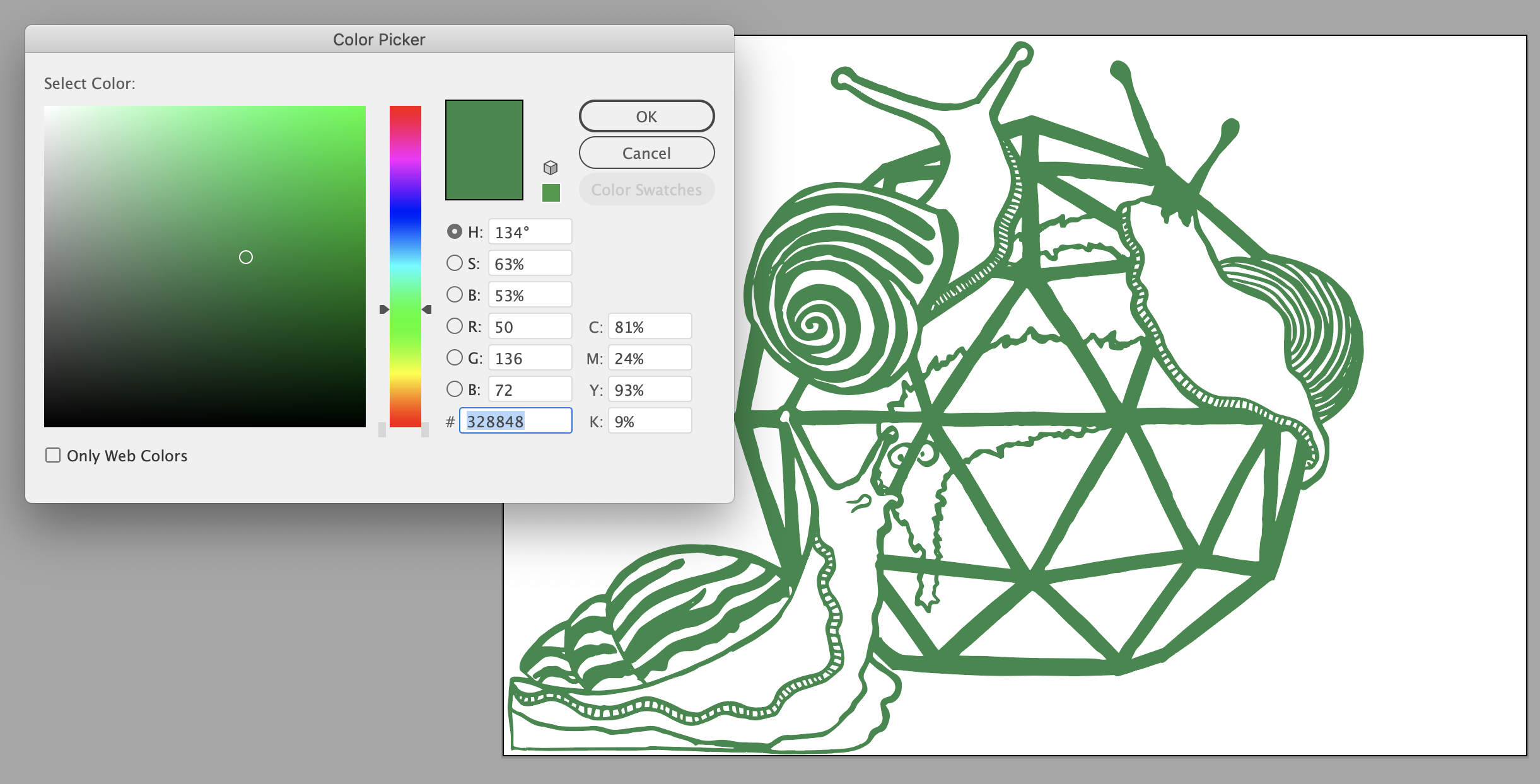
In the end I went for the dark green – colour #164431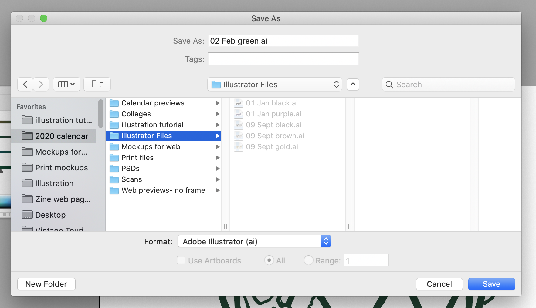
Then save it as an Illustrator file with the default settings, and close it in Illustrator.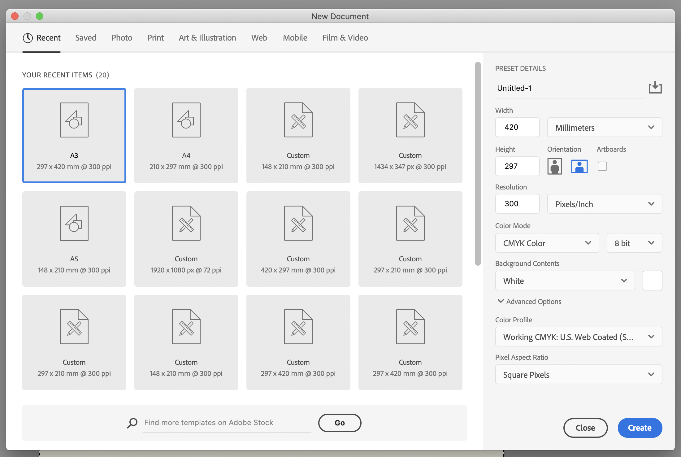
I then open up Photoshop, and create an A3 document. I always work in A3 even if the eventual size will be A4 or A5. It gives you more flexibility and quality. I’m working in CMYK as this is for print. Later I’ll convert RGB versions for online.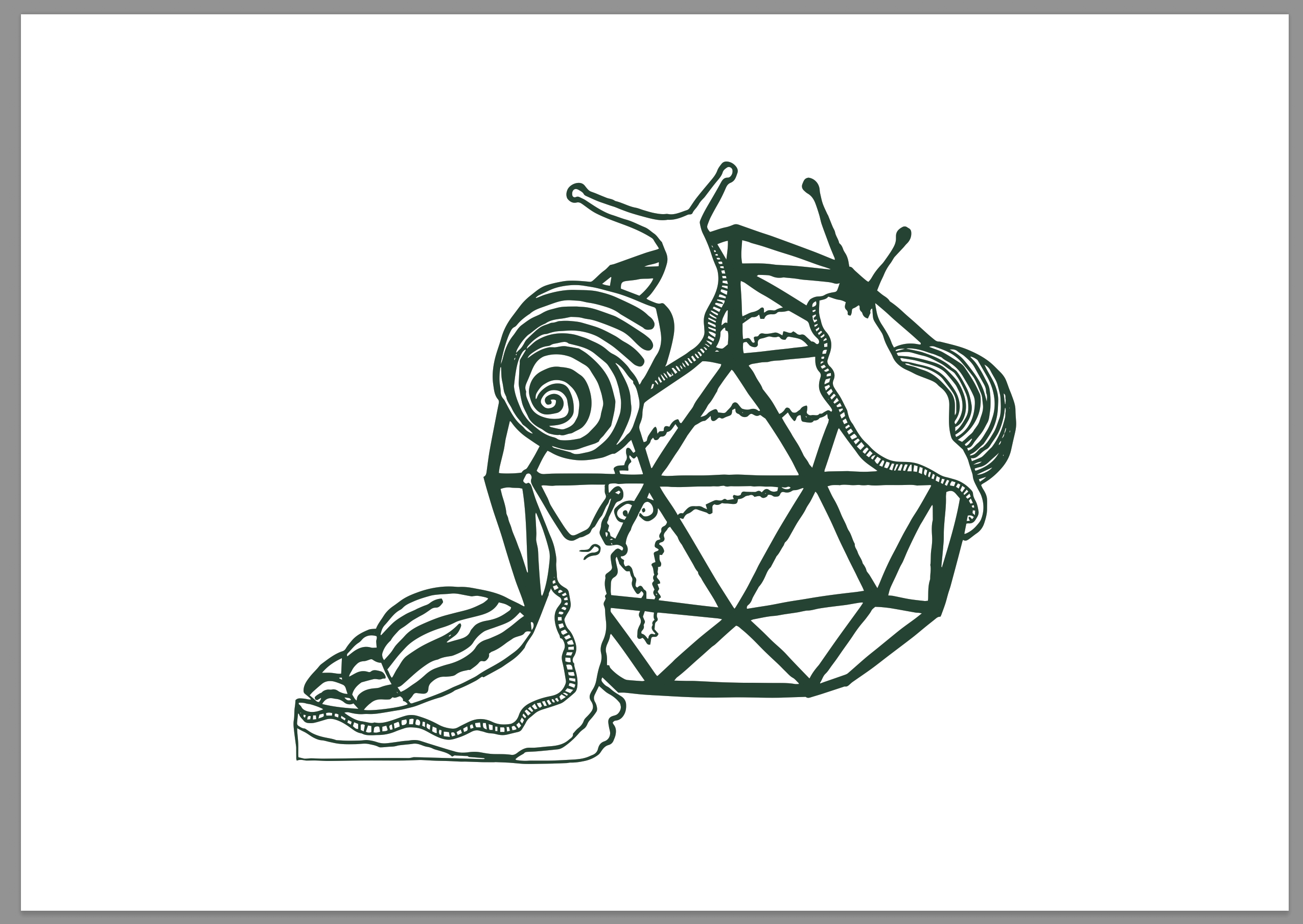
I opened up the Illustrator file, and copied and pasted the image into my A3 document. I then hit cmd+T to resize. For years and years you had to hold shift while resizing in Photoshop to get things to stay proportional, but Adobe finally listened.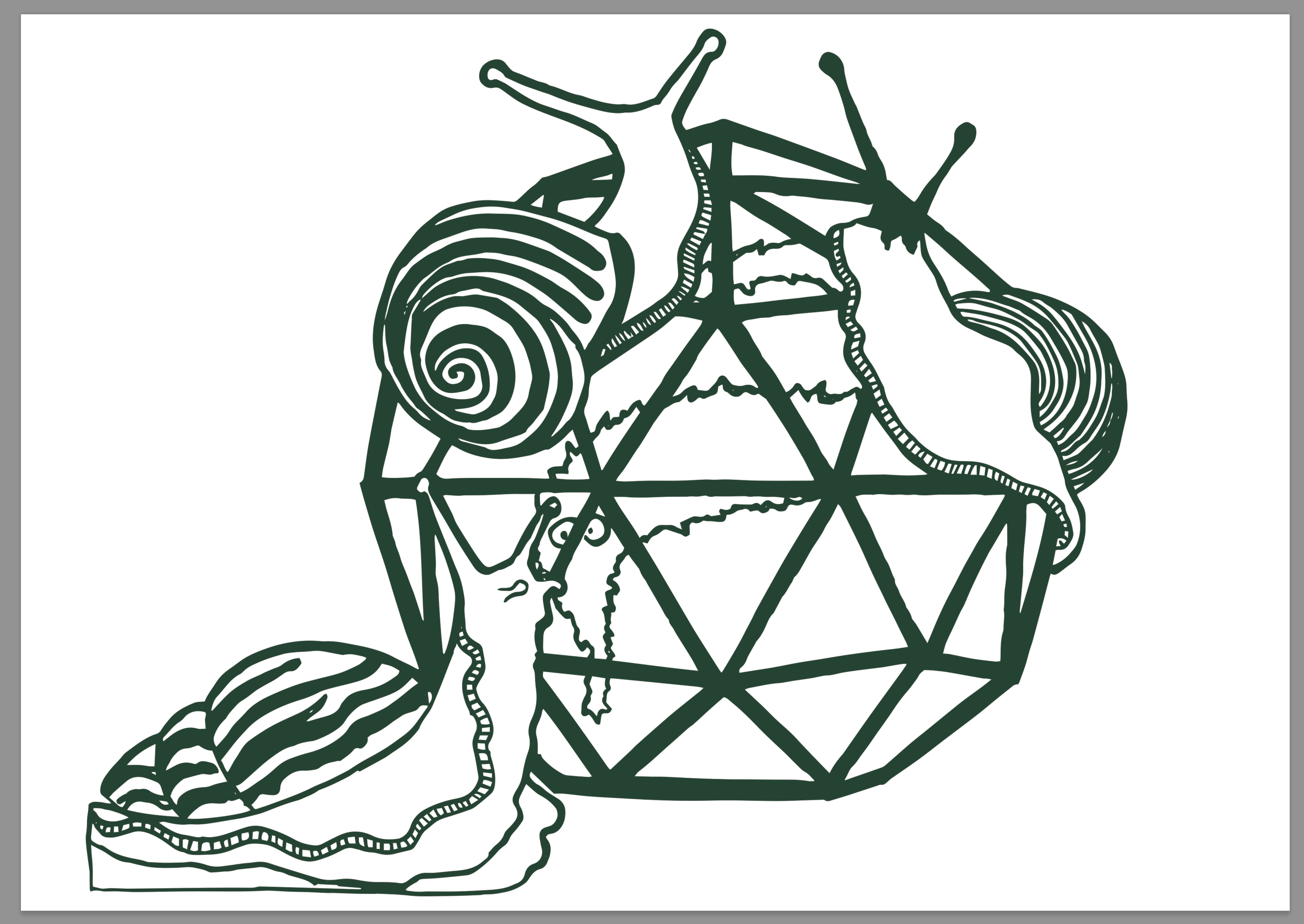
Resized to fit the canvas. The outline stays as a normal layer, but all the others will be multiply layers to give a bit of transparency and that screen-printed look. If I’m using flat colour tones, I usually use the Add Noise filter to give them a more organic texture at the end of the process.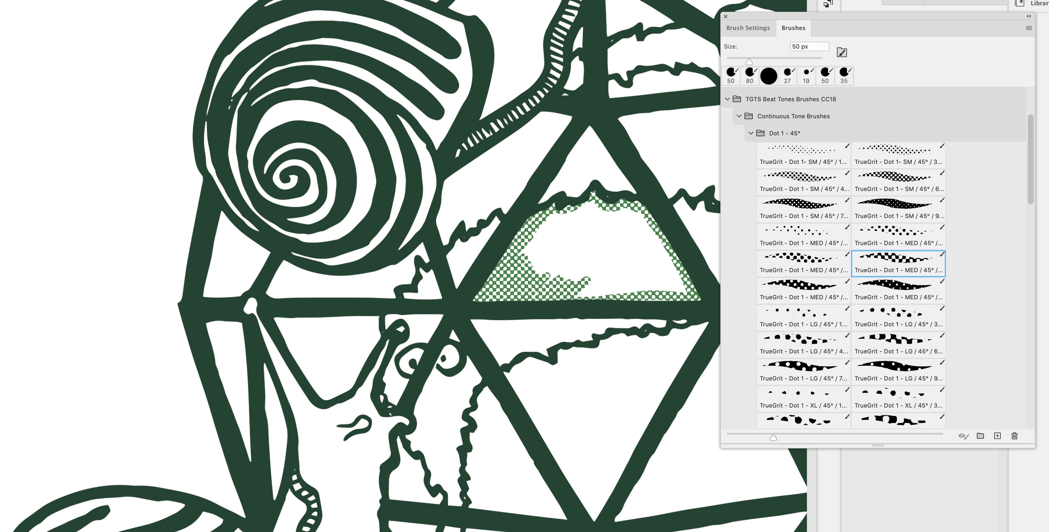
I’ve got a set of these half- tone and line brushes from True Grit Textures. Using two spot colours- a lighter and darker shade of green, and a couple of different patterns you can create a large variety of shading. For each pattern, I create a new multiply layer. It makes it easier to get rid of things if you decide you don’t like them later.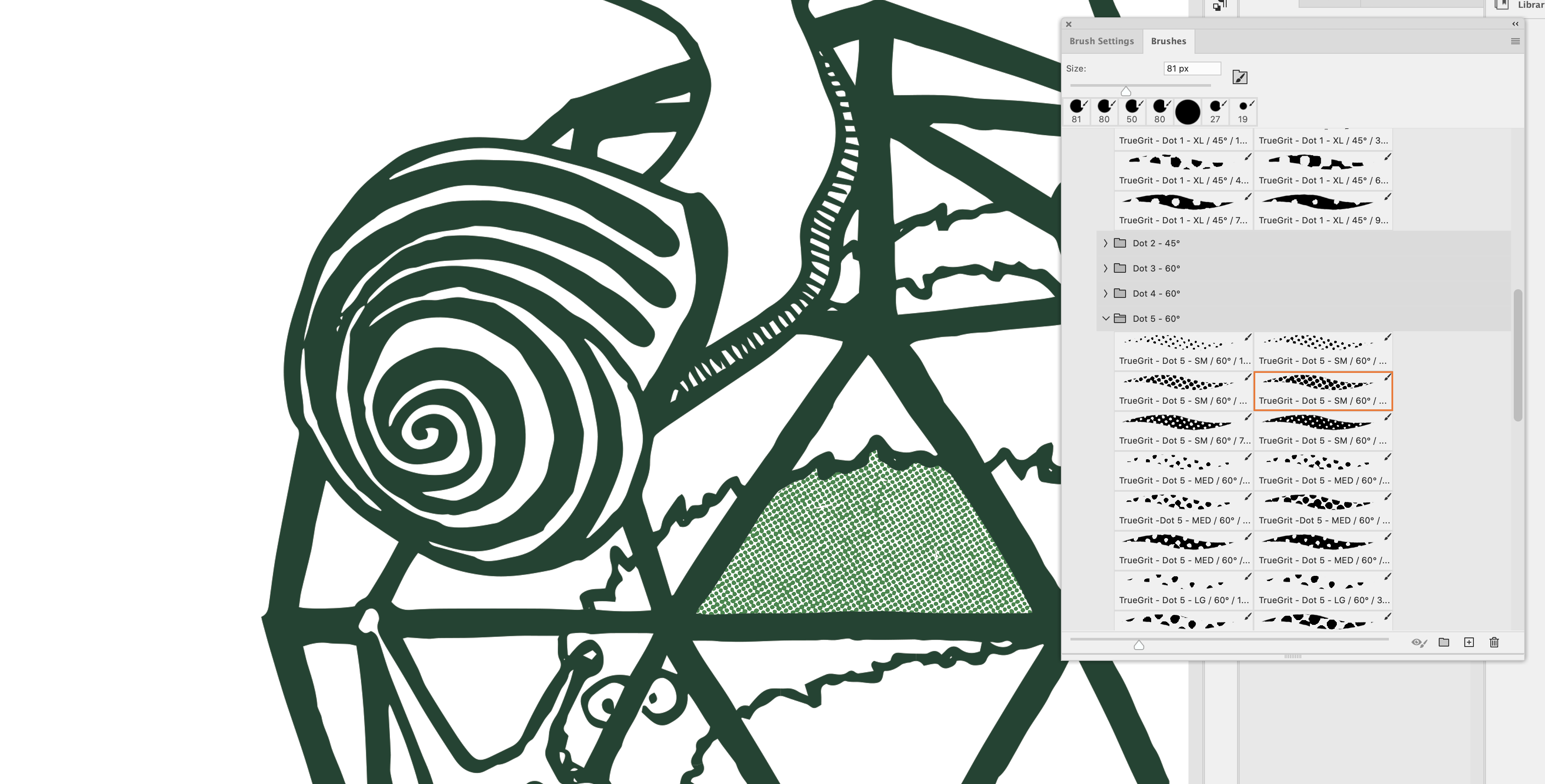
In the end I went for a closer half-tone pattern for the wiggly worm.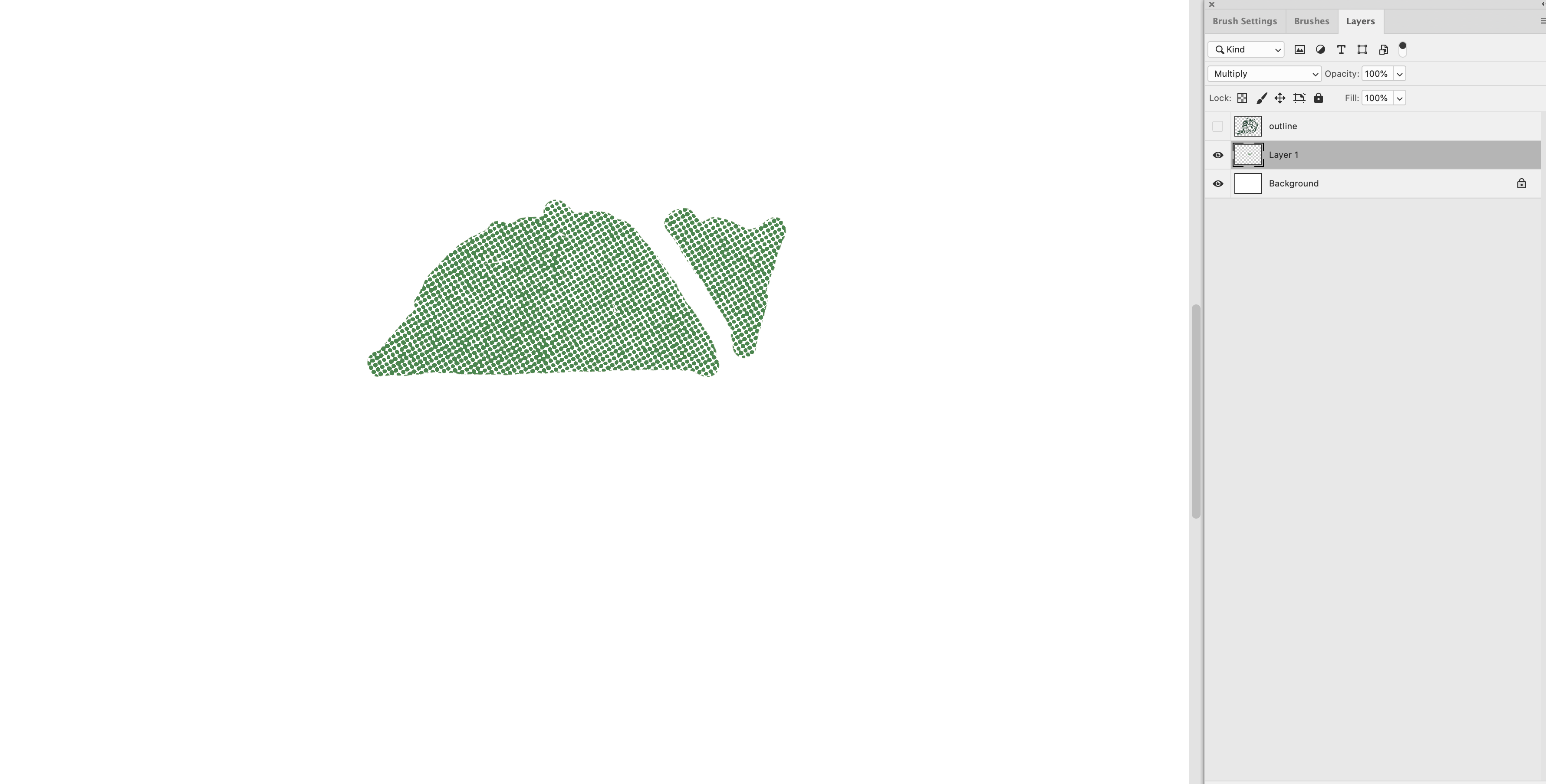
After I’ve finished shading a section, I always hide the outline layer to make sure I’ve haven’t missed anything. It all looks a bit MS Paint like this.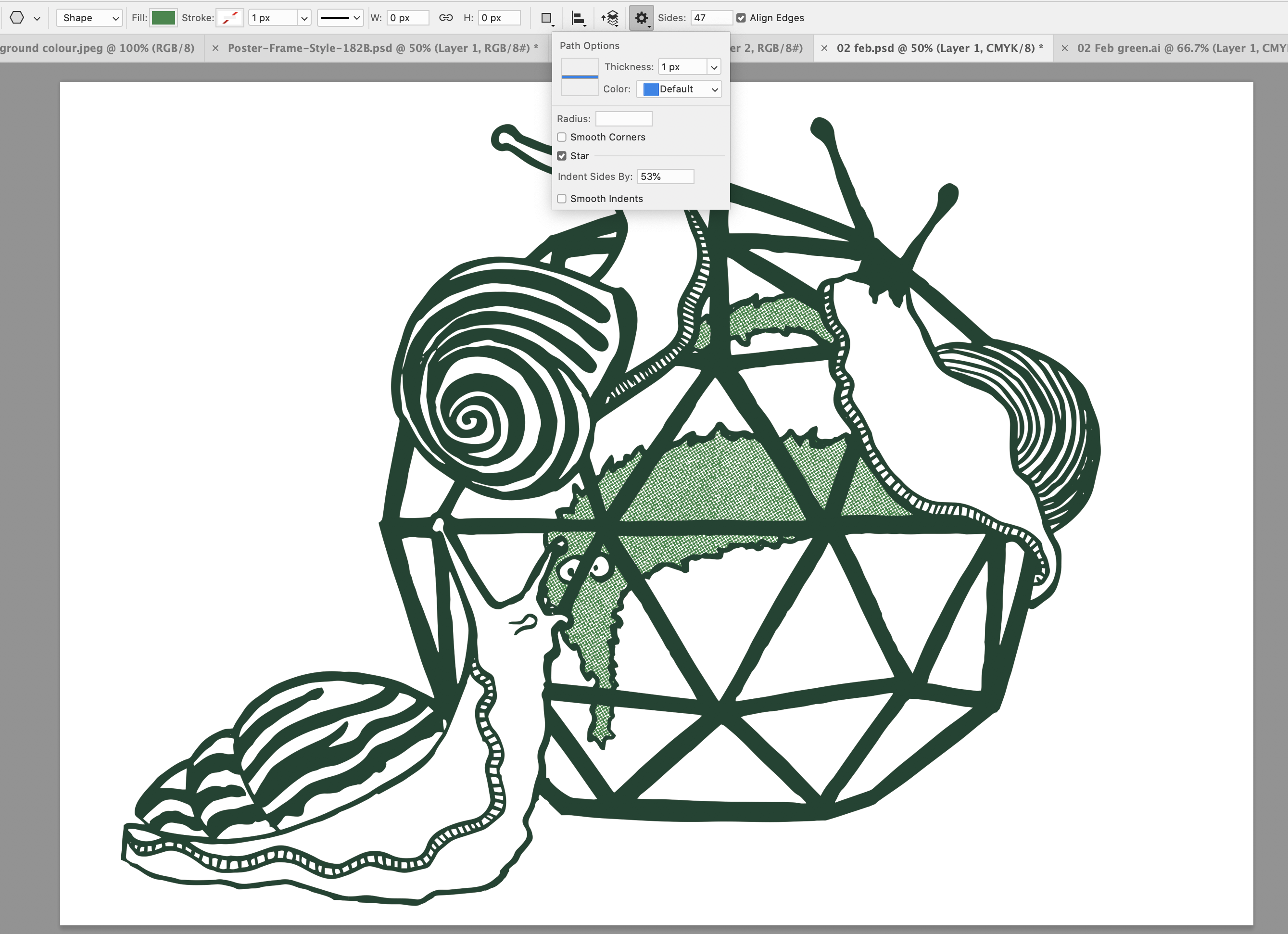
I decided that I didn’t like the slime trail, so I erased it. I also wanted to add in a background star shape. Using the polygon tool, I set it to 37 points to make it a bit less regular and grid-like.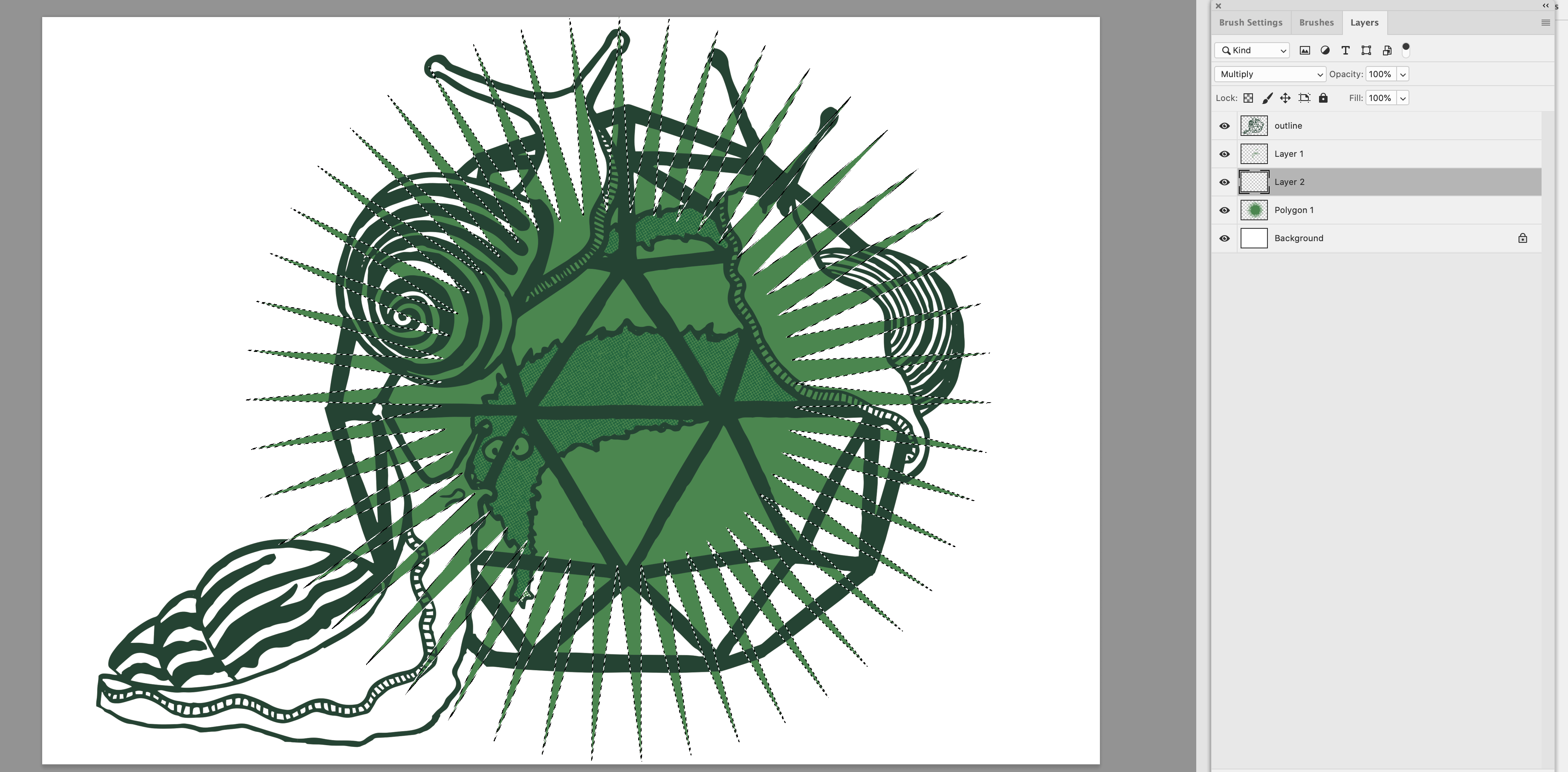
I used a flat colour, and then used the magic wand to create a mask.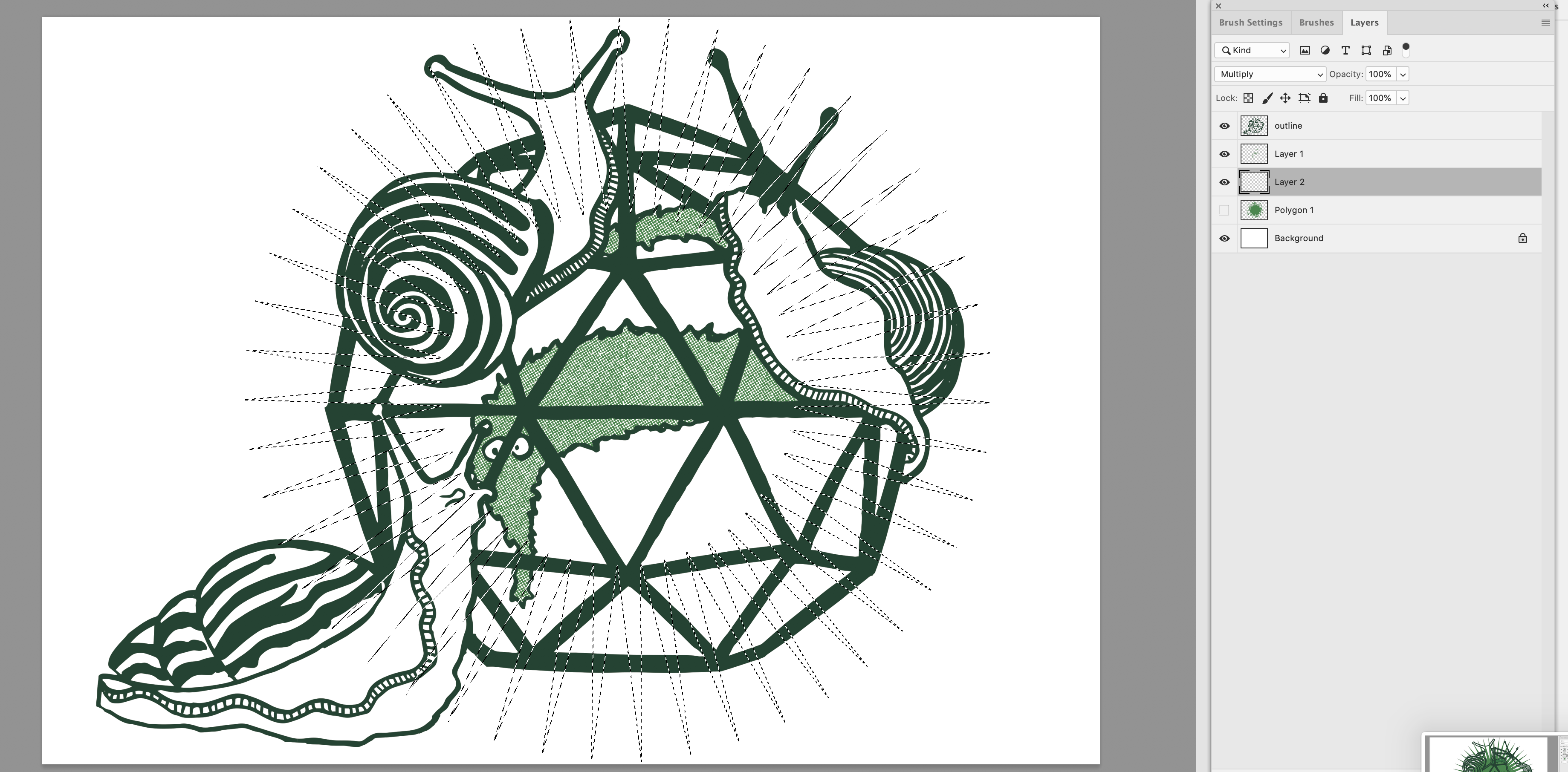
Hiding the flat colour, I can now use the mask to shade in another multiply layer of dot patterns. I did it by hand rather than do a basic fill, because I only want the star to show behind the glass, not in front of the snails.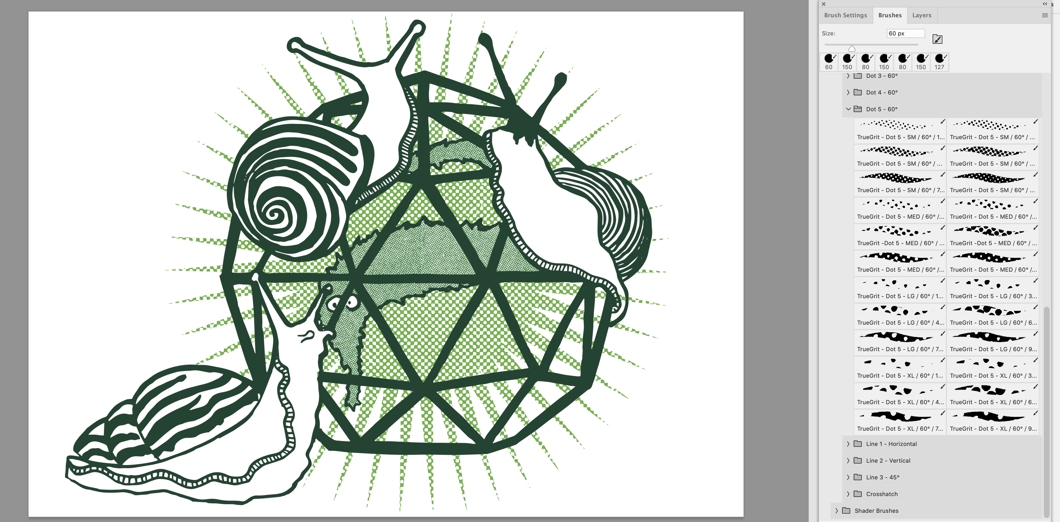
Here’s the star filled with half-toning.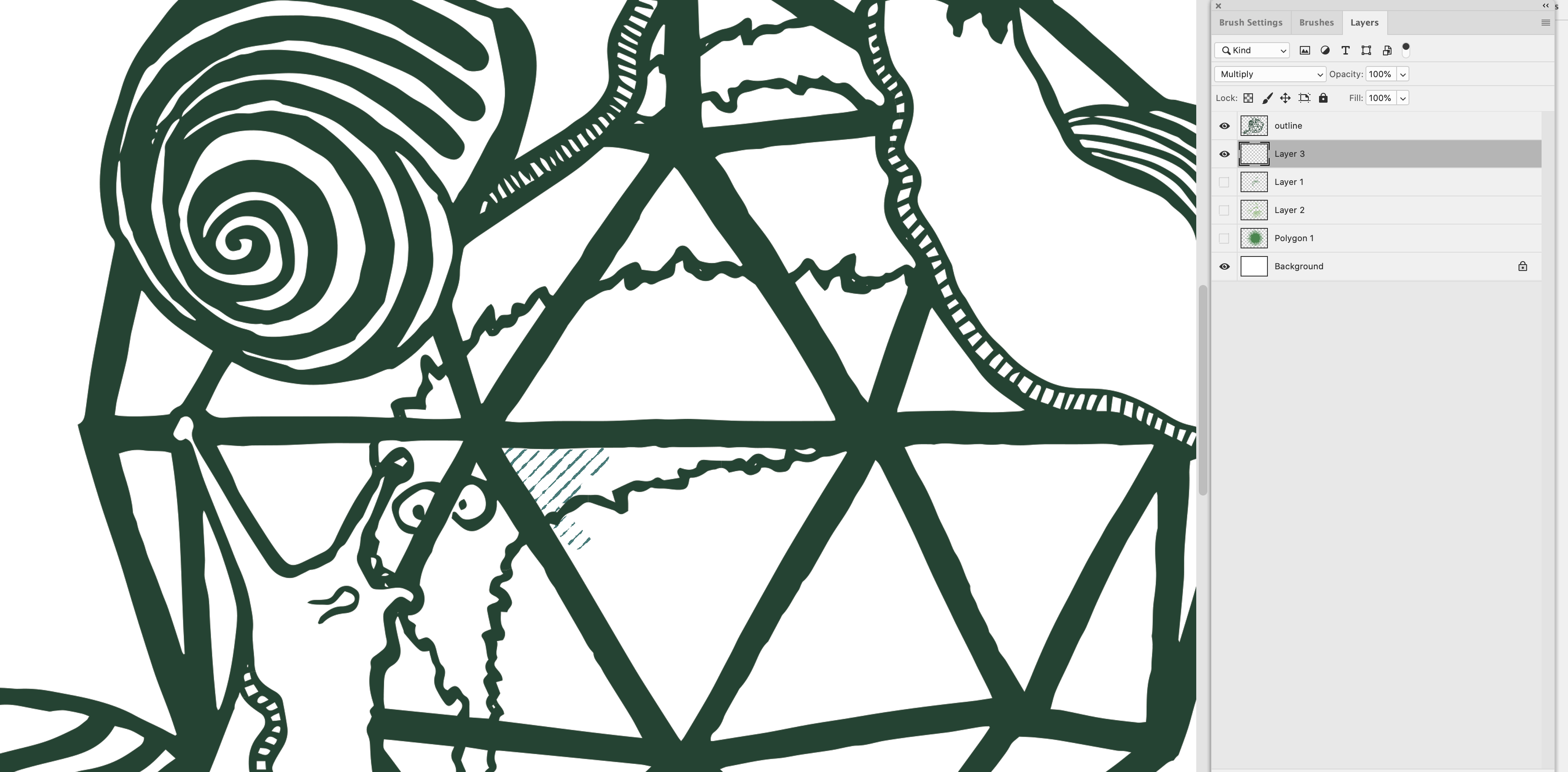 I temporarily hid some of the layers to use this faded hatching brush to give the glass a little texture
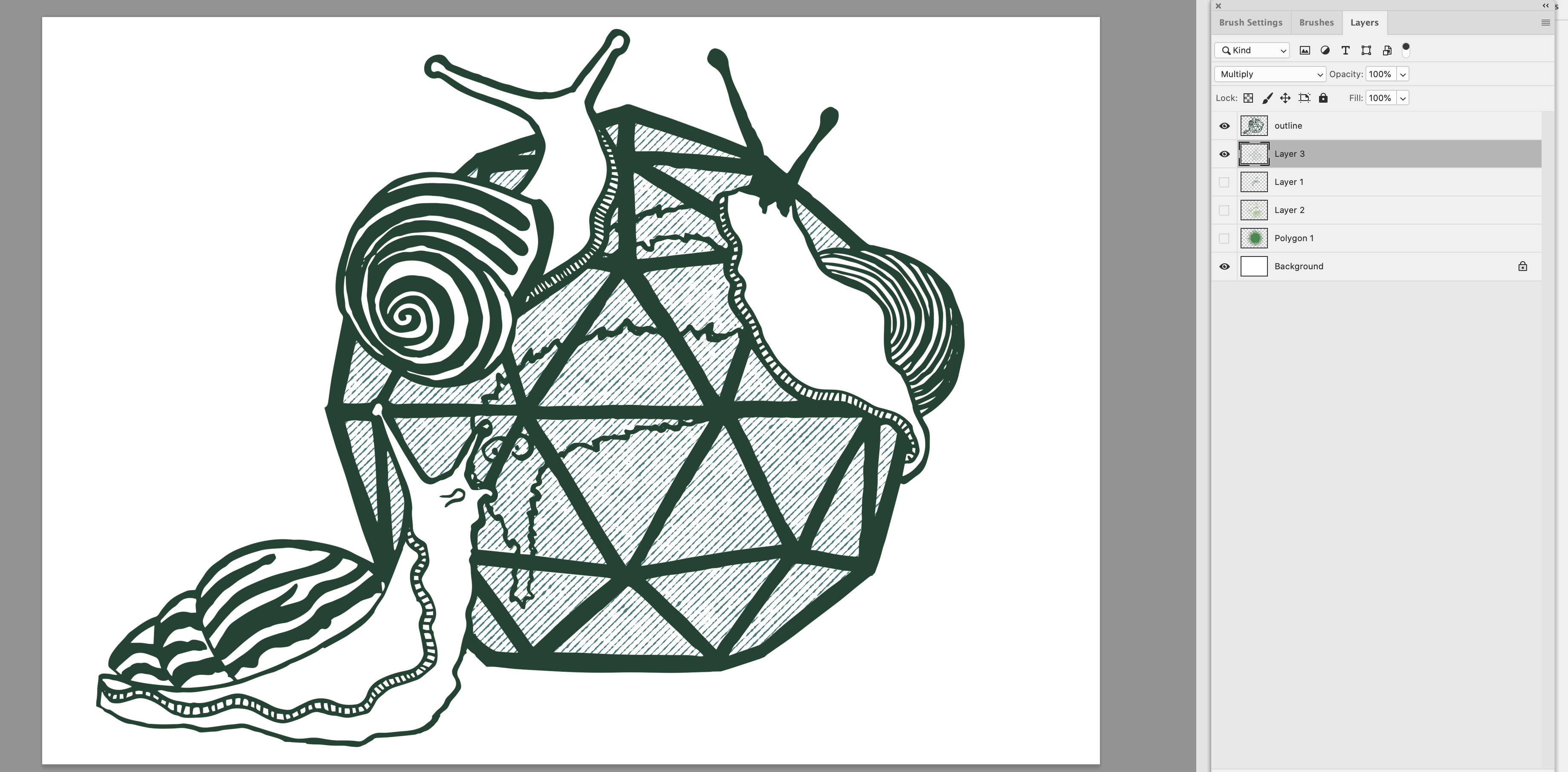
The wurm is imprisoned.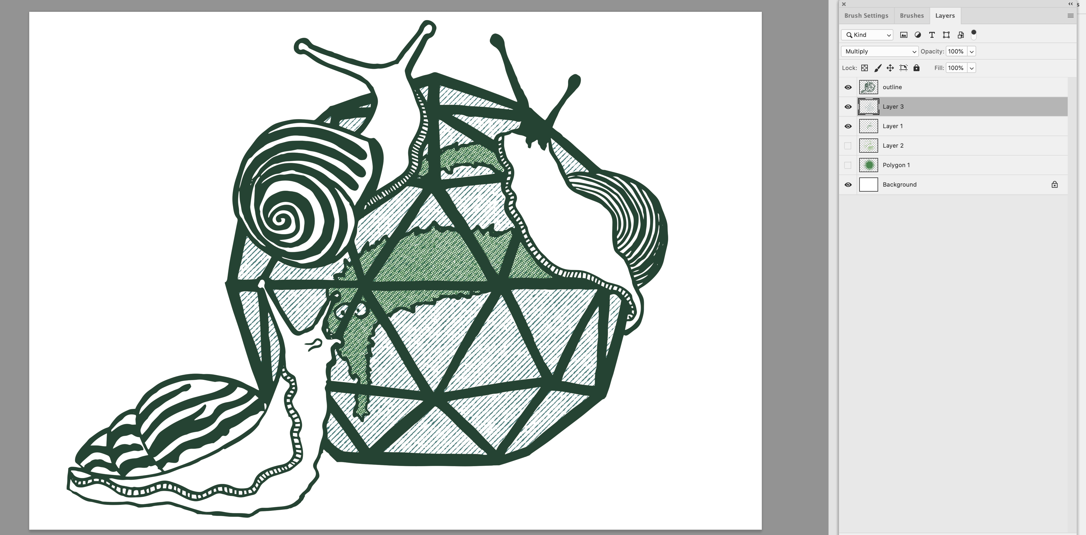
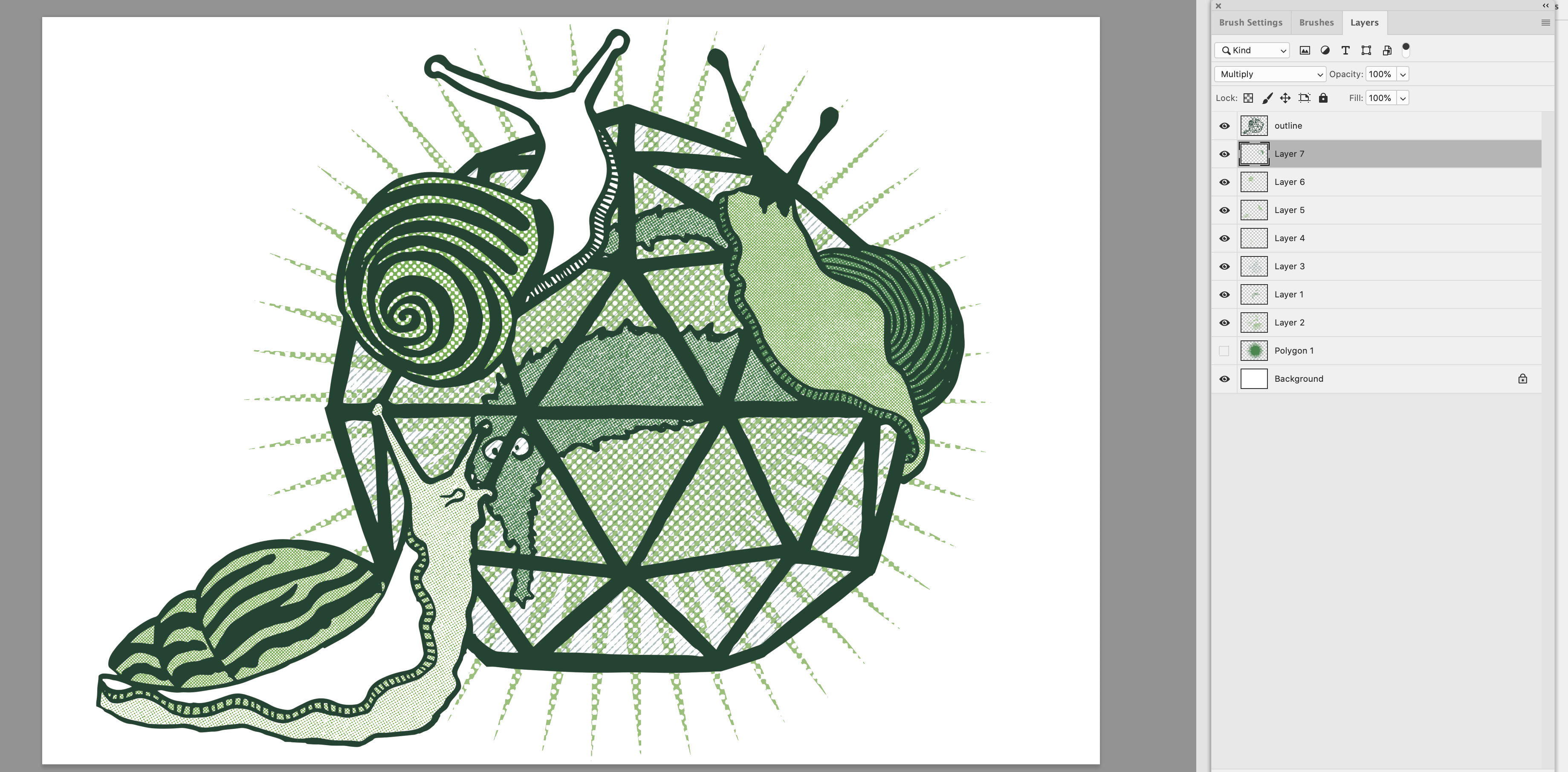
I adjusted the opacity of the star and the glass shading a little to make them less dominant.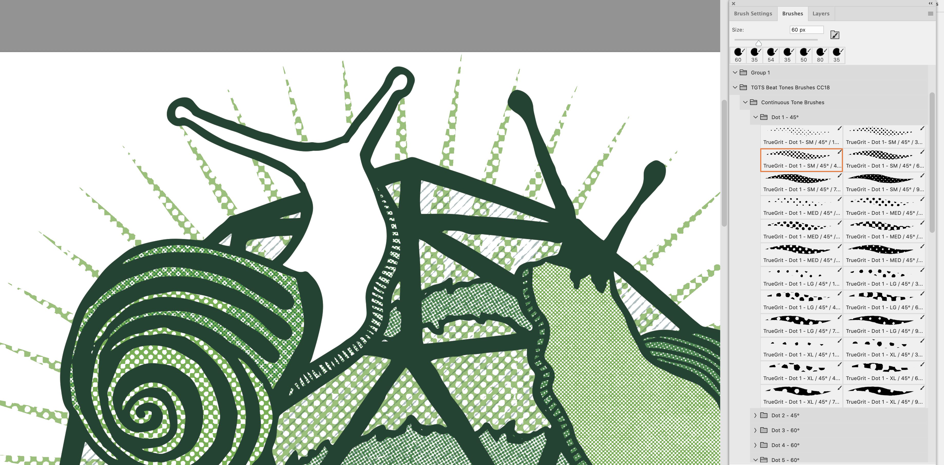
I then used various different brushes and the two shades of green to colour in the snails. This is another advantage of using multiply layers- I decided the left shell was too similar in tone to the star pattern, so I added another layer of smaller dots to blend in and create a new pattern.
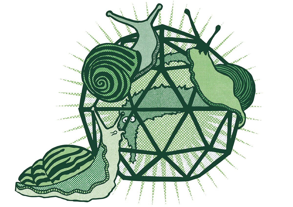
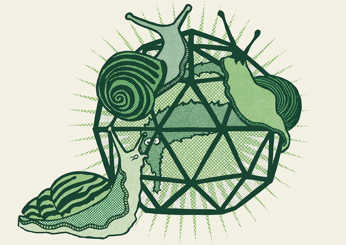
The finished article. I had a test print to see if I liked it on the paper (which I did).
Adding a layer on the PSD file with the cream colour of the paper to create an mockup of how it will look in the finished calendar.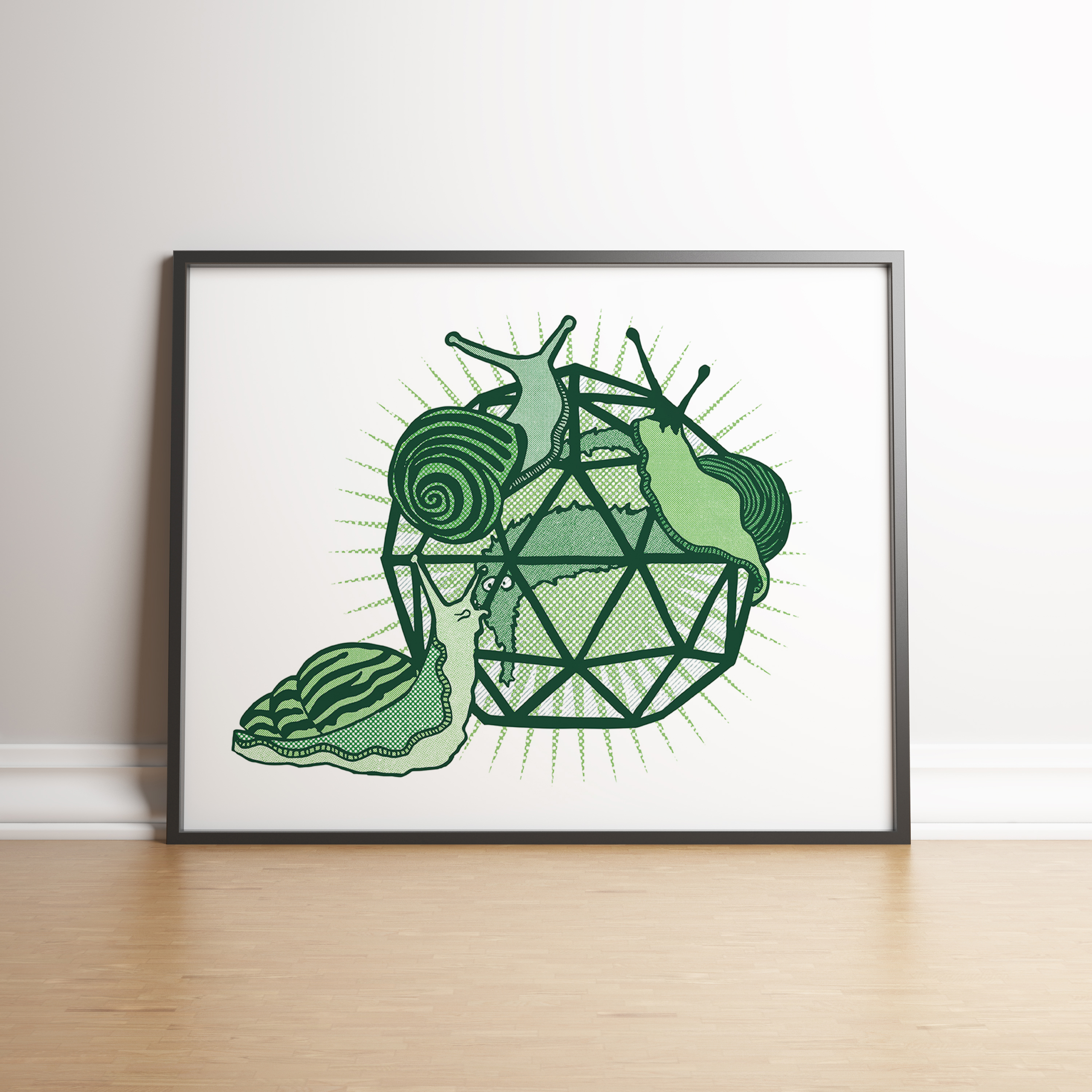
And adding the version with a white background to a Photoshop product mockup to show how it will look as a print.