Over the past decade I have worked as a teacher supporting many SEN students, and as a postgrad student had a side job at a company that did tv subtitling and audio descriptions. Many people want to make their online content more accessible to people with disabilities, and either don’t know where to start, or try but don’t get it right (this is most commonly an issue with image descriptions). So here’s some tips and links to in depth tutorials for various topics.
It’s also important to consider what the context of your content is, and what value the accessibility support will provide to your audience. What information are they missing out on by not being able to see, hear or comfortably read the content, and how can you fix that?
For example, when I made a site for the co-op organisation I was part of, I followed every guideline very strictly, because the content was information, and useful for all visitors.
This blog however is full of lots of purely aesthetic content, so although I tag the images with simple alt text summaries, I don’t know how valuable in-depth image descriptions would be for most of the content. If you can’t see the weird 80s cake decorating book images, my attempt to describe it is not going to help you find it funny.
Choice of design template is also an important aspect- for example for this personal blog I have chosen a decorative theme where the titles of posts appear over an image. I would choose something different and plainer for a purely informational site.
Subtitling
Adding subtitles to videos is very easy, and helpful to a large selection of people: those with hearing or sound processing issues, those learning the language, and people who just want to watch quietly. Search engines also love subtitled videos too.
Many platforms offer automatic algorithmic subtitling now, which varies dramatically in accuracy from video to video. Human-created subtitles are always superior.
Youtube automatically transcribes uploaded videos, and you can edit the resulting subtitles to be more accurate. There are complete step-by-step instructions on this site.
Vimeo doesn’t automatically transcribe, but does let you upload an srt file. You can find instructions here.
Tiktok however doesn’t have full subtitling built in, so you will have to add your own manually as text decorations on the video. There are instructions here.
Subtitles are universally saved as plain text with an .srt ending, so can be edited in lots of different apps. You can also get hold of various free or paid apps to create subtitles, or just use the simple formatting rules (here is a comprehensive guide) to type them up from scratch quite easily.
Some tips:
- Time the subtitle to come on a split second before the audio (if you are in control of the timings)
- If the text is too big for the screen, summarise it. You only get two lines per screen.
- Make sure to include sound effects and music cues for example and mark them in square brackets ie [loud explosion] or [piano music in background] or [music- Happy Birthday] [♫ Happy Birthday ♫].
- Make sure to preview the video with your subtitles and check that they sync right
On the music front, whether you describe the music (ie “sinister music starts”) or name the artist and the track depends on the context. You can find the music symbols here.
General text formatting + Dyslexia
People have an idea that if you just slap some Comic Sans on text, it will become dyslexia friendly. Sadly this is not the case. Even the idea that sans-serif fonts are better is not always the case, because many of them have the letters p, d, b and q looking very similar, which causes problems.
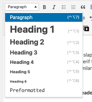
Something that is always helpful with dyslexia though is having clear structure. Use section headings, short paragraphs, and clear sentences. Using bold and italics for word emphasis is also helpful for many people. Don’t use rambling lead-on sentences or huge walls of text. Block capital text can also be difficult.
On websites, use html heading styling on the section headings (and paragraph for the main text) rather than adjusting the font manually. I have used h3 here. This makes sure it will work the same on computers and on phones and tablets.
Left-aligned text with a ragged right edge is better than justified text, because it helps break the “wall of text” effect that is a problem for people with dyslexia.
Make sure that the font is a reasonable size, and has good strong contrast with the background. This is also helpful for people with visual problems. Very dark grey, almost black tends to be easier on the eye with a white background rather than stark pure #000000 black. Avoid colour combinations that make the text harder to read, especially if they will be a problem for people with colour blindness who see red and green as very similar.
Letter and line spacing is also important- make sure the lines have a comfortable gap between them and the letters aren’t squeezed together or spread apart. The default settings are usually fine for this, but sometimes you do have to adjust these.
Some people with dyslexia find that laying a sheet of coloured acetate over the page helps. Different colours work for different people. Online, you can use browser plugins such as Noverlay or Dyslexia Formatter to change the colour background and the font.
Keeping your site design clean and simple, without cluttered layouts is very helpful to both people with dyslexia and ADHD (which often overlap). Autoplaying videos, especially in sidebars, are a particular irritant. Don’t fire loads of extraneous content and information at users who are already having to concentrate hard to absorb the main content. News and magazine sites are the worst culprits for this, because they try so hard to monetise every inch of the screen.
Image descriptions and screen readers
The thing that I see the most mistakes with is image descriptions. The idea is to help people with visual issues by writing a text description of the image. Many people who have visual disabilities use a text reader, where the computer reads everything out to them. Excess, or poorly positioned or formatted text becomes very annoying. For example using fancy unicode characters as text such as ℌ???? will not say “hello” on a screen-reader, but “mathematical fraktur capital h, mathematical fraktur small e, mathematical fraktur small l, mathematical fraktur small l, mathematical fraktur small o”
You ????? it's ???ℯ to ????? your tweets and usernames ???? ???. But have you ???????? to what it ?????? ???? with assistive technologies like ?????????? pic.twitter.com/CywCf1b3Lm
— Kent C. Dodds ? (@kentcdodds) January 9, 2019
The big issue with how a lot of people write image descriptions is that they don’t identify and focus on what the image is communicating and how or why, they just describe everything they see and give it all equal weighting and description. The result isn’t helpful to someone who can’t see or process the image, it’s a confusing mess, and difficult to listen to or follow. The recommended length for an image description is about the same as a tweet- 240 characters, not a paragraph.
Of course if the image is just text, you should write it out, but pictorial images need some thought in how to successfully describe them.
Images are used for various purposes- purely decorative, to illustrate points in text, provide further clarification or information, or for ironic purposes. The aim of image descriptions is to have the same level of communication available for people who can’t see the image for whatever reason. To do this successfully you have to identify what the purpose of the image is, and how it is used to communicate on the page.
When I worked at the subtitling place, there was a voiceover actor who did audio descriptions of tv and film. She would narrate the action in between the dialogue. She didn’t describe the things in the background or the unimportant shoes someone was wearing, her focus was to make sure that people who couldn’t see the screen and only heard the dialogue could understand the story in the same way as viewers who could see all the visual cues.
It’s also important to think about when and why an image description is useful and important, and what the context is for it being useful to your audience. For example when I made a site for a disabled-accessible music venue I was part of, it was very useful for screen-reader users to know they weren’t missing out on any information because they weren’t seeing the images, and longer descriptions were useful.
On this blog however, a lot of the content is purely visual and only there for the visual content, and people aren’t going to get a lot out of a description of my drawing of a snail or a 70s craft book. (However as I have already said it’s always good practice to use the alt tags to provide a brief description of images on websites- it also plays a big role in search engines finding and categorising your site properly).
Websites and HTML
WordPress and many other sites let you add in descriptions in the background. Alt text is for a very brief summary (and also helps Google index your site correctly), and the description for a longer one. The caption box is for a caption that appears to all users by default, not for accessibility image descriptions. Here is a more indepth guide to how they are used.
(Yes I know that’s a $2 AUD coin, I realised my mistake after taking the screenshot).
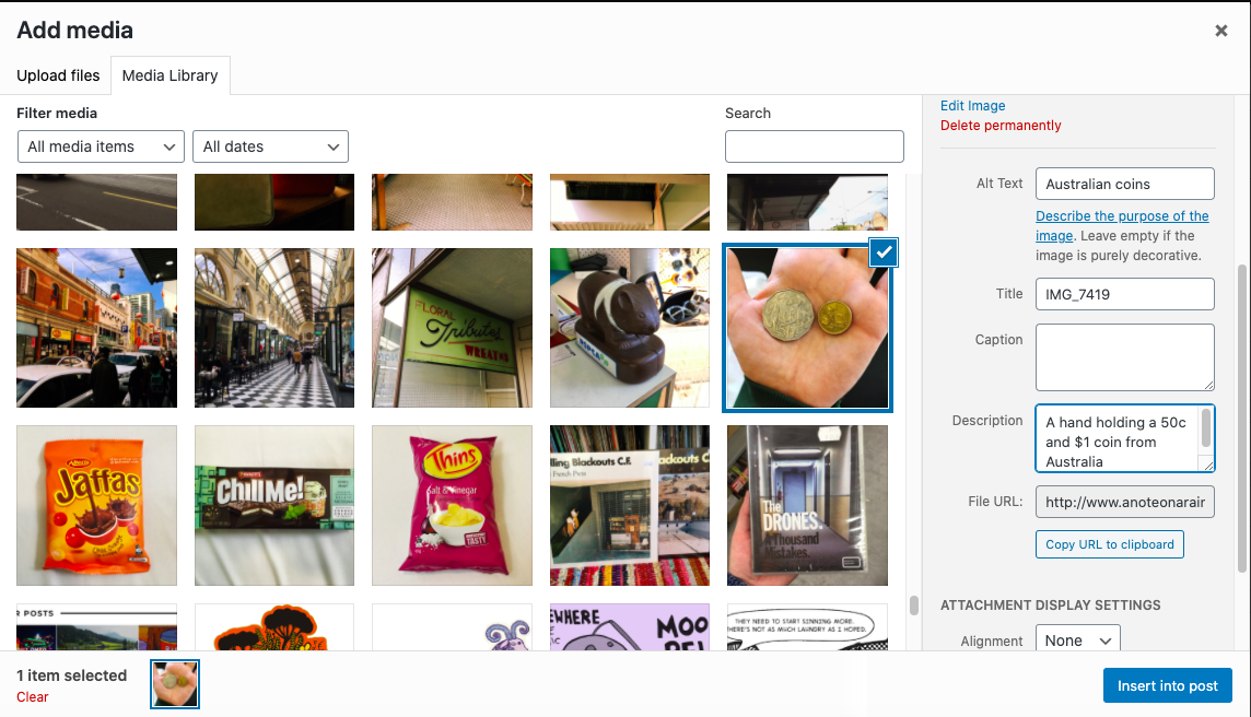
A lot of my older images on this site have lost their alt tags from being restored from a backup. I’ve been using a WordPress plugin that lets you bulk edit them in batches, rather than having to click through to each image. There are a lot of plugins with this function to choose from, but best practice of course is to remember to label them as you go.
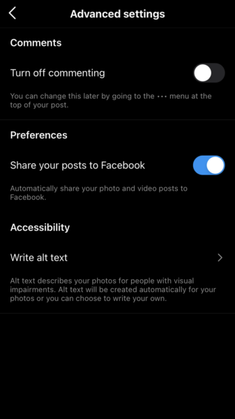
Instagram also has alt text built in now, but it’s hidden away. When you make a post, scroll to the bottom of the new post screen and you’ll find “advanced settings”. The option to add an image description is hidden in there. A lot of people who are using image descriptions on Instagram put them in the main text, because the alt text option is so hidden away.
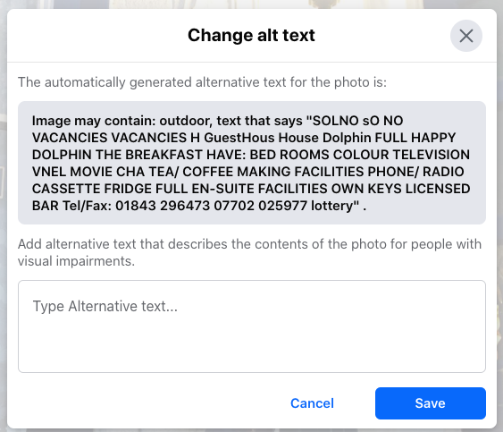
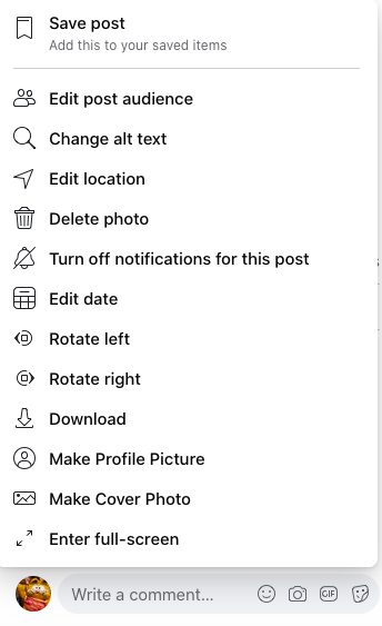
Facebook tries to autogenerate alt-text, but it is very very bad at it. Here is an example of its attempt at a hotel sign. You can currently edit it yourself by clicking the three dots on a photo you’ve posted and choosing “change alt text”
Examples of helpful and unhelpful image descriptions
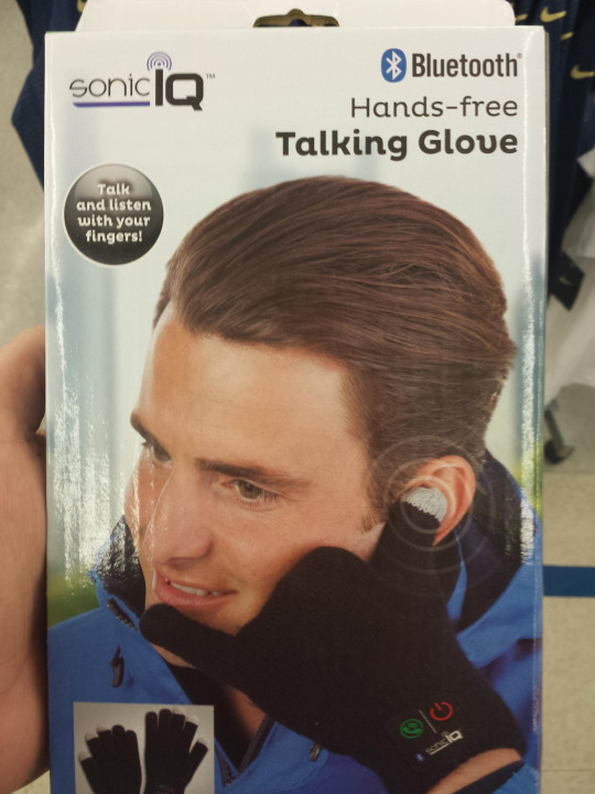
Unhelpful: “A young white man with swept back short brown hair and brown eyes is looking into the distance. He’s wearing a blue waterproof jacket and black gloves. He has his thumb on his ear and his little finger on his mouth. The black glove has green and red icons on it and some small text. In the corner is a logo saying “Sonic IQ”. On the right hand side is a Bluetooth logo
Helpful: “Packaging for Bluetooth hands free talking glove. Slogan “talk and listen with your fingers”. A young man is modelling the glove by miming a phone call with his hand.”
What is the intended focus of including this picture? It’s not the model or the blue jacket, the focus is on the silly and probably useless product.
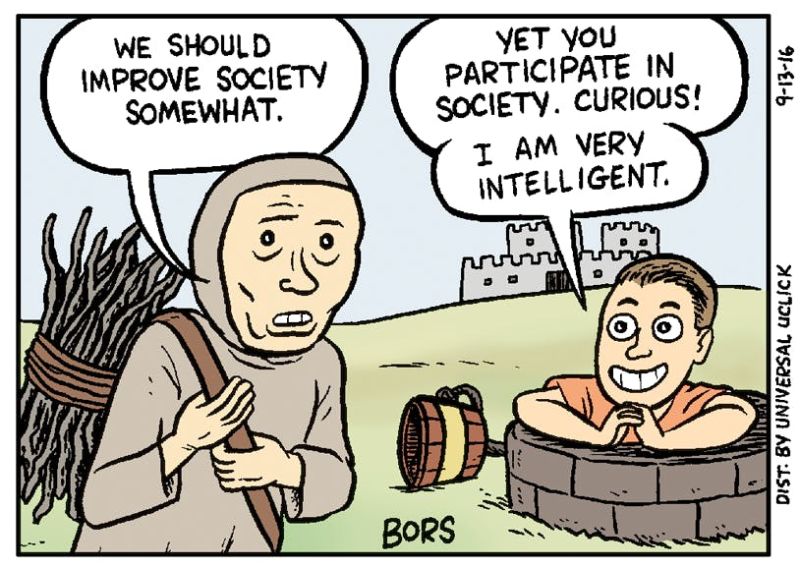
[Image description]
A medieval peasant is carrying firewood in front of a castle. A smug looking modern character pops up out of a well and sits with craned fingers.
Peasant: We should improve society somewhat
Smug character: Yet you participate in society. Curious! I am very intelligent.
[/Image description]
(If the image description will be in the main text, you can put it between some tags like this to make it clear what it is)
Adding in descriptions of the green grass, the bucket lying on the floor or the fact that the castle has two turrets doesn’t help someone who can’t see it understand the cartoon, and just clutters up the text more. Ability net has some good guidance.
Similarly, describing the peasant character as “wearing a hooded grey garment, with under eye bags, and carrying a bundle of twigs tied into a bundle with rope” doesn’t communicate the cartoon very well. The artist used the trope of a downtrodden feudal peasant from old paintings as a visual shorthand for someone who is getting shortchanged by society. Adult viewers in English speaking countries would usually recognise this cliche and understand what the artist is conveying via visual cues.
The important thing about the character with the orange shirt is not that they are wearing orange or have brown hair, it’s that they have a smug and superior facial expression and body language.
Again- the most important thing to consider is what is the image communicating and how? And how can you make the description communicate the same thing?
Here is a very helpful guide to help you choose the focus of your descriptions, and make them concise and descriptive.